
Intro to User Experience
Class 2
Intro to User Experience
Class 2
Welcome
Girl Develop It is here to provide affordable and accessible programs to learn software through mentorship and hands-on instruction.
Some "rules"
- We are here for you!
- Every question is important
- Help each other
- Have fun!
Introduction
I'm here to help!
- Twitter: @lordmikeang
- Email: michaelangelodecarlo@gmail.com
Agenda
- Prioritizing Problems
- Exercise: Prioritizing Problems
- Getting Buy-in
- UX and Project Management
- Information Architecture
- Interaction Design
- Wireframing
- Rapid prototyping
- Iterating on Feedback
- Visual Design
- Resource Review
Dark Patterns
The DarknessDark Patterns are different – they are not mistakes, they are carefully crafted with a solid understanding of human psychology, and they do not have the user’s interests in mind. We as designers, founders, UX & UI professionals and creators need to take a stance against Dark Patterns.
Prioritizing Problems
Don't panic!
- Dont jump to extremes
- Scraping the project to start over, usually isn't an option
- What do we do?
- How do we begin?
Not all problems are created equal.
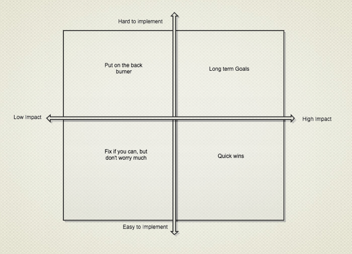
Not all problems are created equal
- The Chart of the UX gods
- Plot your problems
- Get the easy wins
Some sample problems
- Missing login link from homepage
- 60% of users fail to complete major multi-step task without help
- Link color may be difficult for some users to read
- Users must manually select their currency type, instead of having the app do conversions for them
Prioritized
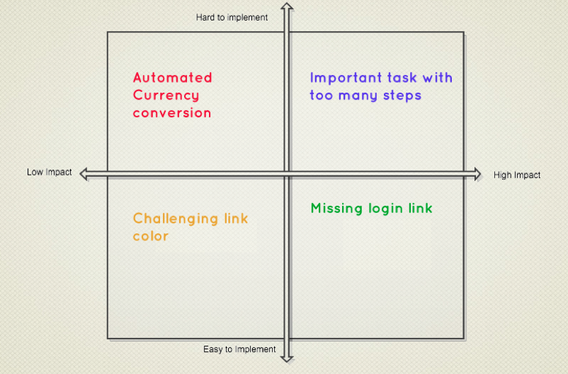
Band-aid or Shotgun?
- Your long term goal sorts of problems are likely symptoms of needing some major overhaul. They wouldn’t be difficult to implement or hard to determine a solution for if there were any easy fixes. Get out the shotgun for these.
- Bandaids, however, are fine for your lightweight easy to fix problems. If you can find any easy, low-tech way to make it happen, do it.
Iterative Fixes
- bandaid or shotgun? does it fit that description?
- How do we take care of bigger problems?
99% of Problems
- Most problems can be solved with a more moderate approach
- find your ideal solution
- Break it down
- figure out which pieces you can implement right now to ease the pain
- Rinse and repeat
5. Exercise: Finding Problems & Prioritizing
- Go to CNN.com or if anybody is feeling brave we can use your site
- Take 10 minutes to find three things you think might be problems.
- We'll discuss as a group, and then try to prioritize fixing them.
6. Getting Buy-in
- I hope this is optional for some of you
- Trust the process
- Take matters into your own hands.
- Buy-in is earned not given
Create a process document
A document can help lend authority and substance, demonstrating to management that this is serious, grown-up business.
Start doing
Examples
- Guerilla testing: Martin Belam describes it as “the art of pouncing on lone people in cafes and public spaces, [then] quickly filming them whilst they use a website for a couple of minutes.”
- The single biggest factor in getting buy-in for this stuff is to get test results in front of people.
- Be the evangelist
- Lurk
- Be patient
Share your successes
If it's working, let everyone know!
- Quotes from users stating when something is easy.
- Before and after screenshots or heatmaps.
- Before and after user testing video
7. Working with Project Management
Where does UX fit in?
Waterfall
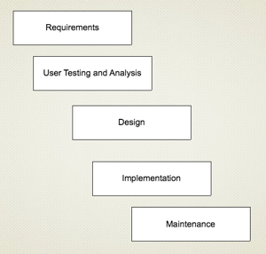
UX for Waterfall
- Allows more time for careful analysis
- Less flexibility in rolling out fixes quickly
- Be careful about prioritizing fixes, since you have less ability to roll them out quickly.
- Plan for detailed deliverables and careful analysis documents.
Agile
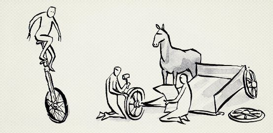
UX for Agile
- Things can be fast and furious
- Fixes can be implemented quickly, or take more time if they’re larger
- Rapid turnaround times allows for real life feedback, which can decrease the need for in-depth studies before deploying
Key differences of Agile UX
- Low fidelity design artifacts, like paper prototypes
- Collaborative brainstorming/design
- Immediate feedback from users and colleagues
- People and ideas over artifacts
Information Architecture
We’re going to delve in and do some more hands on work, focusing on learning some techniques you can apply when you’re working towards fixing these problems you’ve discovered.
The 'Scent' of a Website
Human Computer Interaction
(available to NC residents via NC LIVE)
People look for certain words in a similar way that a foraging animal would look for certain scents.
Example
- Determining whether users are catching the scent is something you will do through testing and metrics
- look at is the individual words that you’re using
- Lets discuss
- Google Page Speed Test
Card Sorting
Card sorting is a simple technique in user experience design where a group of subject experts or "users", however inexperienced with design, are guided to generate a category tree or folksonomy. It is a useful approach for designing information architecture, workflows, menu structure, or web site navigation paths.
Pick out all the 'things' in a site
- Write them down, each seperately.
- Look for groups and patterns
- People, places things
- Put things that are alike together
Hub and Spoke Diagrams

- Come up with a description of what makes things alike
- SAT logic: X is to Y as A is to B
- Nouns, verbs, and adjectives
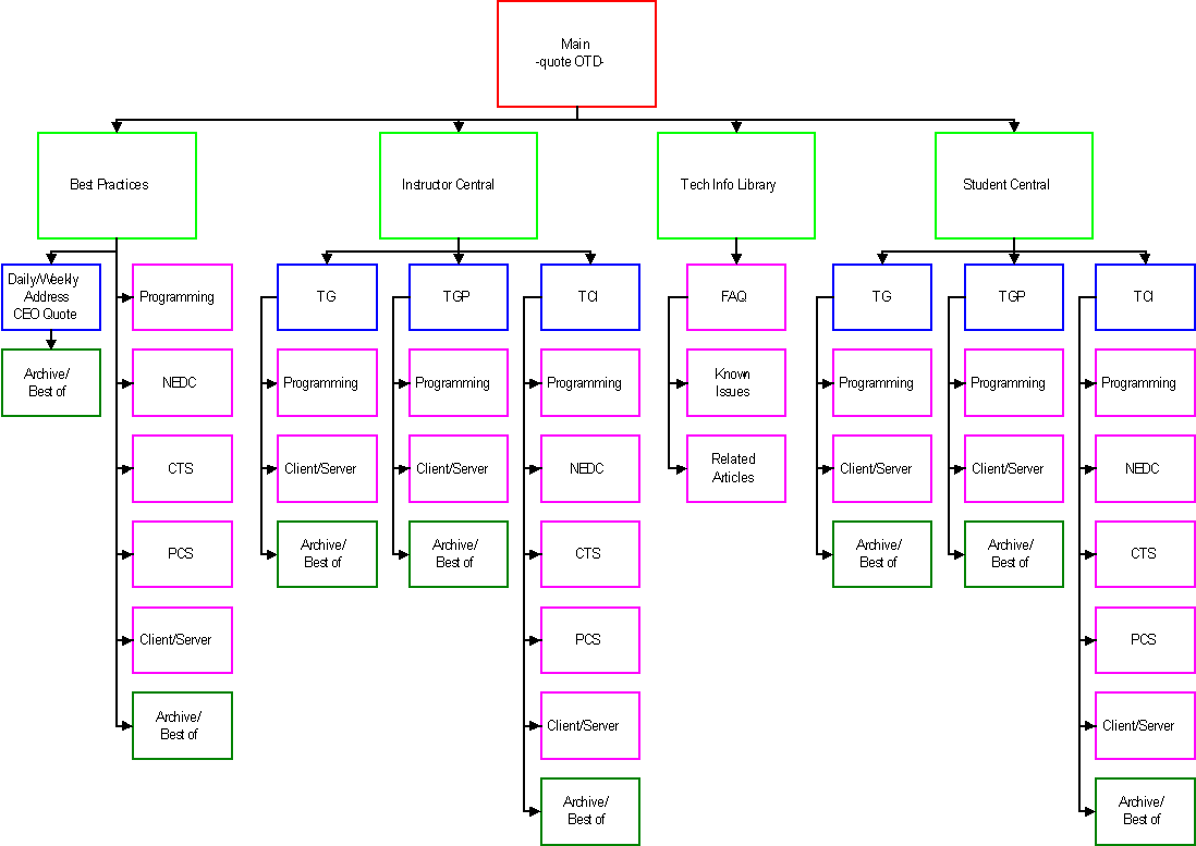
Sitemaps
Interaction Design
Make a map
- make cards
- make a map
next slide has the requirements
Example Requirements (look for keywords)
- User uploads a file
- Superuser is notified, approves and rejects file
- File is posted to website, or is not posted
Example Requirements
- User logs in, uploads a file
- Superuser logs in, is notified, approves and rejects file
- File is posted to website, or is not posted
Some holes
- What does the user see before she has uploaded a file?
- Can the user see other files she’s uploaded in the past? Can she edit them?
- How is the superuser notified? Email, RSS feed, in-app messaging?
- What happens when the superuser rejects a file? Is the user notified?
- Is the user notified when the file is approved? When it’s posted?
Exercise: Let's map it out
A note on states
- A given page or section of a website or application may be variable.
- Buttons and links can be disabled, active, already viewed.
- Content may be filtered
- Always indicate visually to the user what is happening
- See also: affordance
3. Wireframing
- why?
- Separate layouts, architecture, and interactions from branding and color.
- Less emotional
- Quick to implement
- Example
Wireframing Tools
- Balsamiq
- Mockingbird
- Cacoo
- Adobe Suite
- Omnigraffle
- MS Visio
Paper/Whiteboard Wireframes
4. Prototyping in Code
- The way of the future
- Telepathic design implementation
5. Getting Feedback
- Iterate
- Don't get attached
Exercise: Make a wireframe
6. Visual Design
This is where all your hard work starts to pay off
You've already done the hard part!
Usability and Color
- Color affects accessibility. (Up to 10% of the population is colorblind*)
- We have cultural expectations about color. What does that mean?
- We have years of training using computers with certain conventions.
Some common conventions


Contrast
Lack of Contrast
Fonts
Fun != easy to read.
Get feedback from professionals
- UX Stack Exchange
- Forrst
- ConceptFeedback
- Dribbble
- Other social media
7. Resource Review
Books
- The Design of Everyday Things. $18 on Amazon
- Designing Web Usability, Jakob Nielsen. $34 on Amazon
- Don't Make Me Think: A Common Sense Approach to Web Usability, Steve Krug. $22 on Amazon
- The Elements of User Experience: User-Centered Design for the Web and Beyond, Jesse James Garrett. $24 on Amazon.
- Envisioning Information, Edward Tufte. $33 on Amazon.
- Web Form Design: Filling in the Blanks, Luke Wroblewski. $39 on Amazon
Online Resources
Make some friends
Conferences
- An Event Apart
- IxDA
- Agile UX
- IA Summit
- CHI
Meetups- the poor girl's conference
- Refresh the Triangle (Refreshes are everywhere in the US)
- Local chapter of The Usability Professional’s Association, TriUXPA
- Local chapter of Interaction Design Association
- AIGA